Why the lead photo carries so much weight
In our experience the lead photo carries most of the click decision. Browsers scroll fast, and the first image either earns a stop or it does not.
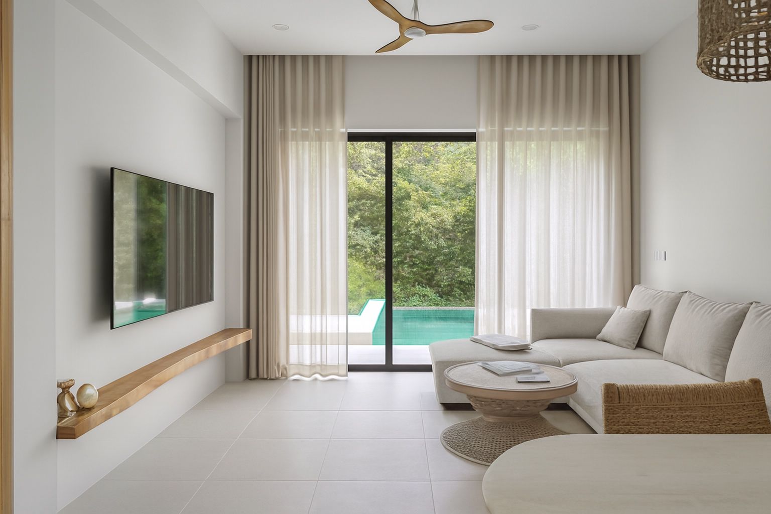
What triggers that stop is rarely the property itself. It is brightness, clarity and order - three signals that the human eye reads before it identifies a single piece of furniture.
Rule one: balanced exposure
A professional interior photo shows detail in the darkest corner and detail through the window at the same time. Cameras cannot capture that range in a single frame the way the human eye can, so photographers blend exposures or lift shadows in post.
The visual result is a room that feels open and airy rather than a bright window surrounded by a dim cave. If you compare an amateur and a professional photo of the same room, this is usually the single biggest difference.
Rule two: true, neutral colour
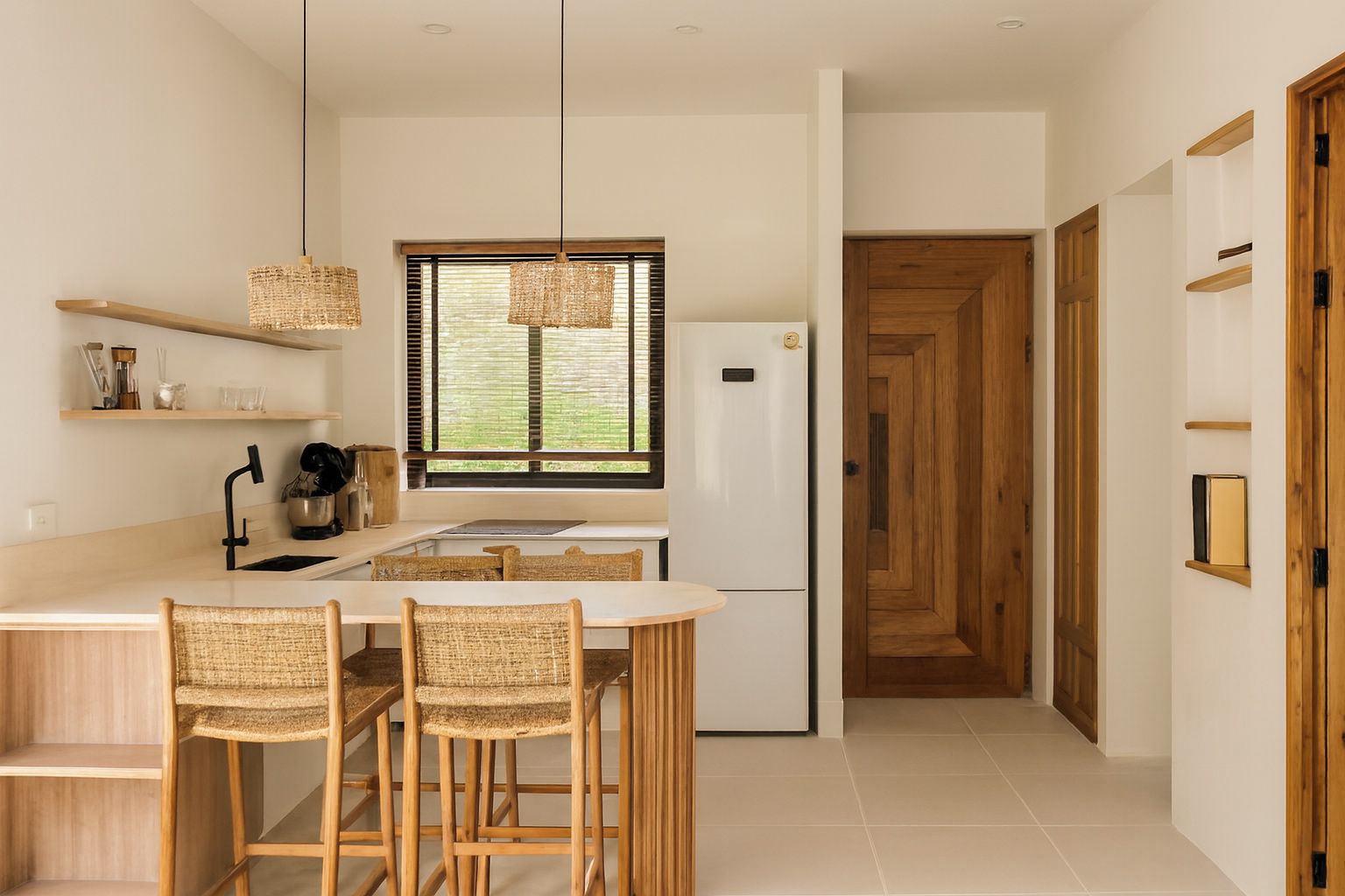
White walls should look white. Warm tungsten bulbs push interiors orange, overcast daylight pushes them blue, and green reflections bounce off lawns and painted walls.
Professional images neutralise those casts so that materials read accurately: oak looks like oak, grey tile looks grey, and skin tones in lifestyle shots look natural. Accurate colour also protects you from complaints that the property looked different online.
Rule three: straight vertical lines
Door frames, window frames and wall corners should be perfectly vertical in the frame. When they lean, the room appears to fall away and the photo looks snapshot-like even if everything else is perfect.
This is why professionals use tripods and level guides, and why perspective correction is a standard editing step. It is a small change that carries a disproportionate amount of the 'professional' signal.
The ultra-wide trap
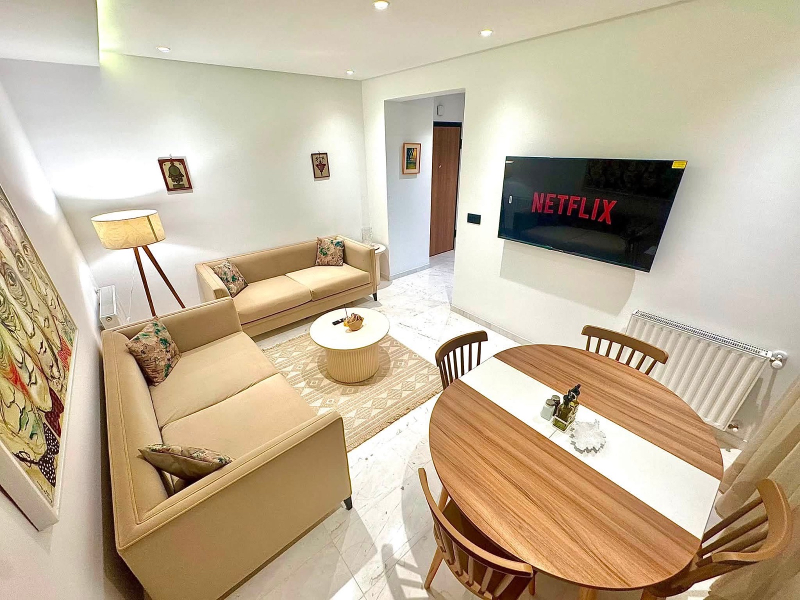
Extreme wide angles stretch the edges of a frame and make a modest room look cavernous. It reads as exaggeration to experienced buyers and disappoints in person. A moderate field of view shot from a corner shows the same space more honestly.
Rule four: composition that explains the space
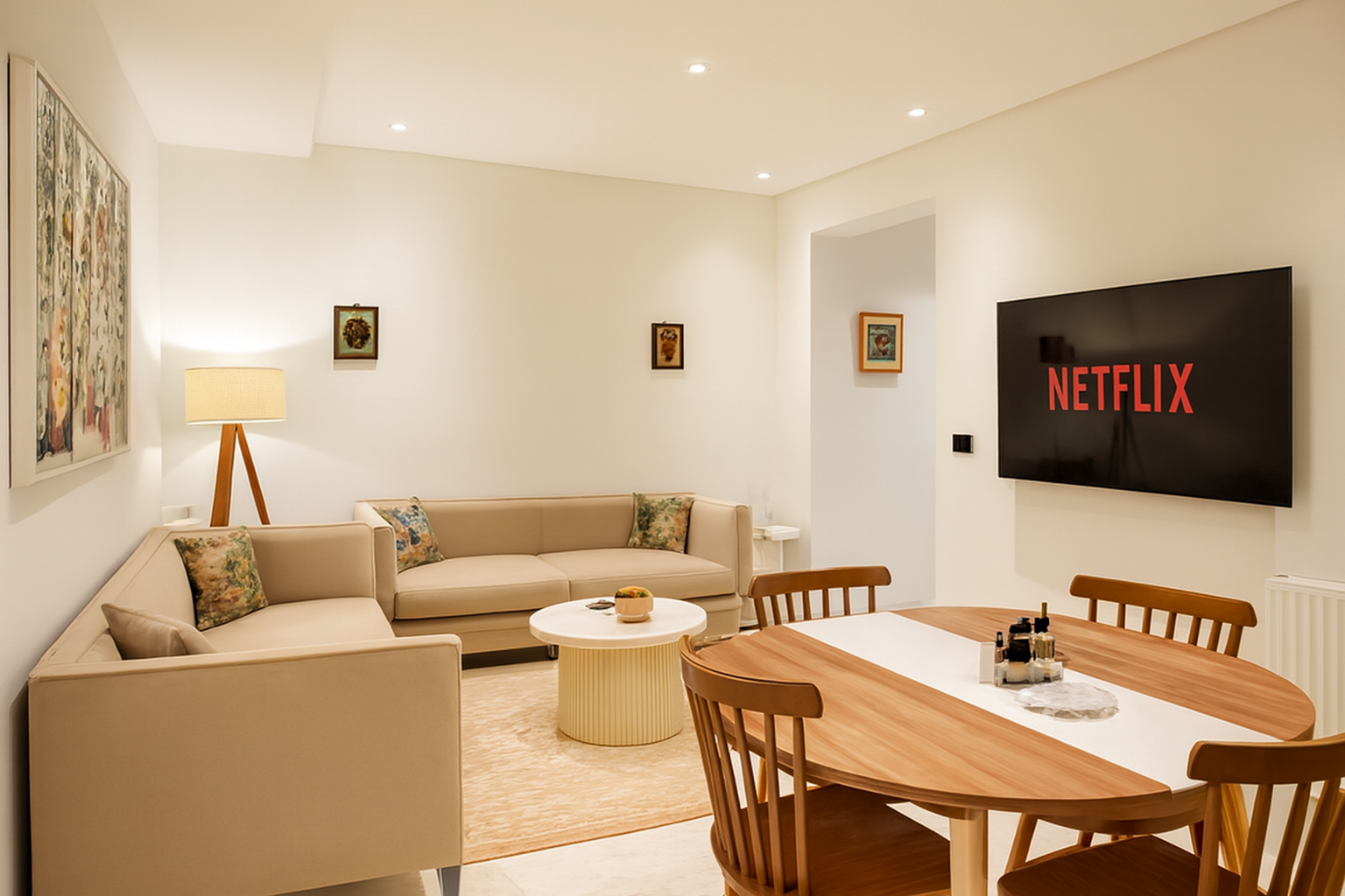
A good listing photo answers a question: how does this room work? Shooting from a corner toward the opposite corner shows two walls, the flow of the floor and the relationship between furniture pieces.
Give the room a subject
Every frame should have an anchor - the bed, the island, the sofa, the view. A photo of an empty middle-of-the-room wall communicates nothing and dilutes the set.
Mind the edges
Half a chair, a sliver of a doorway or a cropped lamp at the frame edge creates visual noise. Step back or shift the camera so objects are either fully in or fully out.
Rule five: the set must match
Professional photography is judged as a set, not as individual images. When brightness, contrast and colour temperature match across every photo, the listing feels curated and trustworthy.
This is the rule most self-shot listings break. Photos taken across different hours, with different lighting and different exposure decisions produce a gallery that feels chaotic even when each individual photo is acceptable.
The non-photographic half: staging
No editing recovers a cluttered room. Clear the surfaces, hide cables, align cushions, open blinds fully, turn off ceiling fans and remove anything personal.
Photographers commonly say that ten minutes of tidying is worth an hour of editing. In listing photography that is close to literally true.
- Clear counters, tables and windowsills entirely, then add back one or two deliberate objects.
- Hide bins, cables, pet bowls, toiletries, laundry and dish racks.
- Remove family photos, certificates and anything with a name on it.
- Open blinds fully and turn ceiling fans off so blades do not blur.
A ten-second self-audit
Open your listing on a phone, at arm's length, and scroll it as a stranger would. Then ask five questions.
- Can I see detail in the darkest corner and through the window?
- Do the white surfaces look white?
- Are the vertical lines vertical?
- Is there anything in frame I would tidy before a viewing?
- Do all the photos look like they were taken on the same day?
Getting the professional standard without a professional
Of the qualities that define a professional set, roughly half are captured in-camera - composition, framing, tidiness, shooting height - and half are produced in post: exposure balance, white balance, vertical correction and consistency between images.
ProLister handles the second half automatically. Upload the photos you shot yourself and each one is returned with the corrections a professional retoucher would apply, in the same visual style across the entire set, so the listing reads as one coherent body of work rather than a series of unrelated snaps.
It is not a replacement for tidying a room or framing it well. It is a replacement for the editing skill and hours that most owners and hosts simply do not have.
Frequently asked questions
Can a bad photo be fixed, or does it need reshooting?
Exposure, colour and leaning lines are fixable after the fact. Clutter, bad framing and severe motion blur are not - those need another shot.
Does the order of photos matter?
Yes. Lead with the strongest room, then follow the route a visitor would walk. A confusing order makes a property harder to understand.
Do I need a wide-angle lens to look professional?
No. A moderately wide field of view helps in small rooms, but extreme wide angles distort proportions and often look less professional, not more.
Should photos be shot during the day or at night?
Interiors read best in soft daylight. Twilight exteriors, shot just after sunset with interior lights on, make excellent hero images for premium listings.
Is HDR good or bad for real estate photos?
Balanced HDR is the professional standard because it preserves both window and interior detail. Over-processed HDR with halos and unnatural colour looks worse than no HDR at all.
How much editing is too much?
If the photo no longer matches what a visitor will see in person, it is too much. Enhance light, colour and clarity - never the property itself.